Johnson & Johnson changes its logo after 130 years.
Did you like the previous logo better, or do you like the new one better?

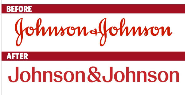
Vote to see the results! 0 answers already!
Johnson & Johnson changes its logo after 130 years.
Did you like the previous logo better, or do you like the new one better?
Join one of the fastest growing communty of investors in Europe
Discuss your favorite stocks, crypto or investing strategies
Get an insight into the markets and become a better investor
Articles and contributions published on the bulios.com server are not investment recommendations. They are only informative. Be careful in your investments and educate yourself.
I wonder what is the reason for that, because the original one is nicer :D
Maybe the J was mistaken for a G?
It's possible :)
Michal wrote a nice and funny comment here why this might be the case😁
And unfortunately it is also possible that this is the reason :D
Well, they probably want to reach new customers who don't need to read the letters anymore and can't and so the old logo for them was nesrozumitelné🤷♂️
Yes, maybe that's the reason 😁😂.
That's possible :D
The change was definitely not necessary, but the new one isn't bad either...
I also think they could have kept the logo, but I guess why not.
So the old one for me definitely:D
I agree :D
Interesting change. Since we're all used to the old one, it looks nicer to me. But it's not changed on the website and stock profile yet, so let's enjoy it while it is :)
I agree, we are used to the logo so we still like the previous one. Otherwise, from what I've read, it's going to be a while before the logo changes and maybe the new logo will be on the products.
Sure, it's not a thing that can be solved anywhere in the world in a day or a week .